
Pilates studios and instructors offer an experience that goes far beyond movement. Your website should reflect that same sense of intention, calm, and professionalism. A well designed Pilates website is not just about looking pretty. It is about communicating trust, clarity, and expertise from the very first click.
Whether you are a Pilates instructor, studio owner, or wellness entrepreneur, your website often becomes the first impression of your brand. Visitors want to quickly understand your style of Pilates, who you work with, what makes you different, and how to book a class or private session. Thoughtful Pilates website design blends clean layouts, soft visuals, clear messaging, and strong calls to action that guide visitors without overwhelming them.
In this post, you will find Pilates website design inspiration that focuses on structure, aesthetics, and usability. These examples highlight how intentional design choices can elevate your brand, attract aligned clients, and turn your website into a powerful business tool.
Yella Studio
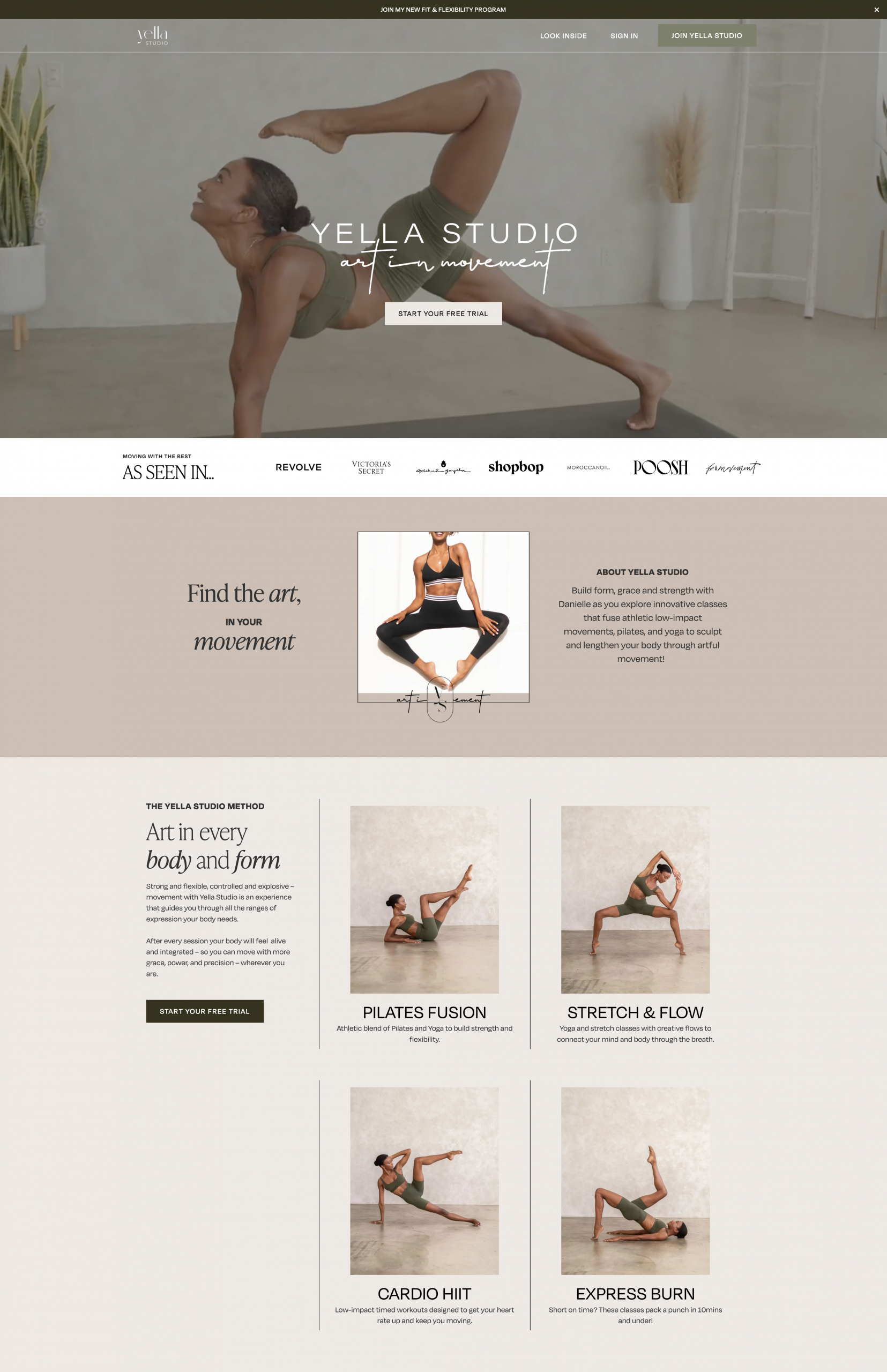
Website: https://www.yellastudio.com/
Made with Webflow
What I like:
This example uses dynamic hero videos of real instructors in action, giving the site an energetic and authentic feel. Embracing motion in the design makes the site feel alive and gives visitors a sense of what to expect in class before they scroll.
Ka Daily
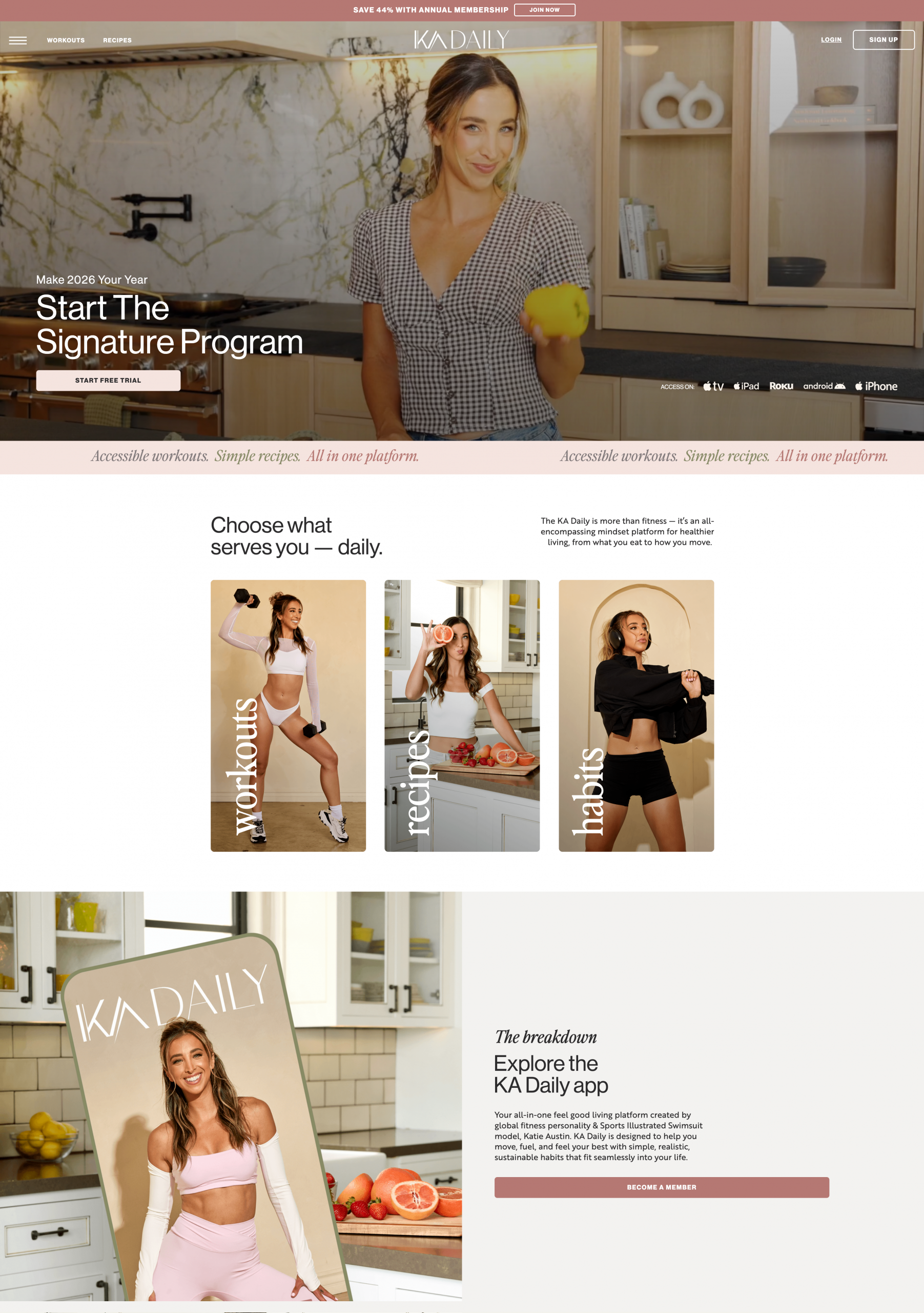
Website: https://kadaily.app/
Made with WordPress
What I like:
Ka Daily is colorful, bubbly, and full of personality. It’s a great example of how vibrant design, aligned with the instructor’s brand voice, can make a site feel inviting and memorable right away.
Body Mechanics Pilates
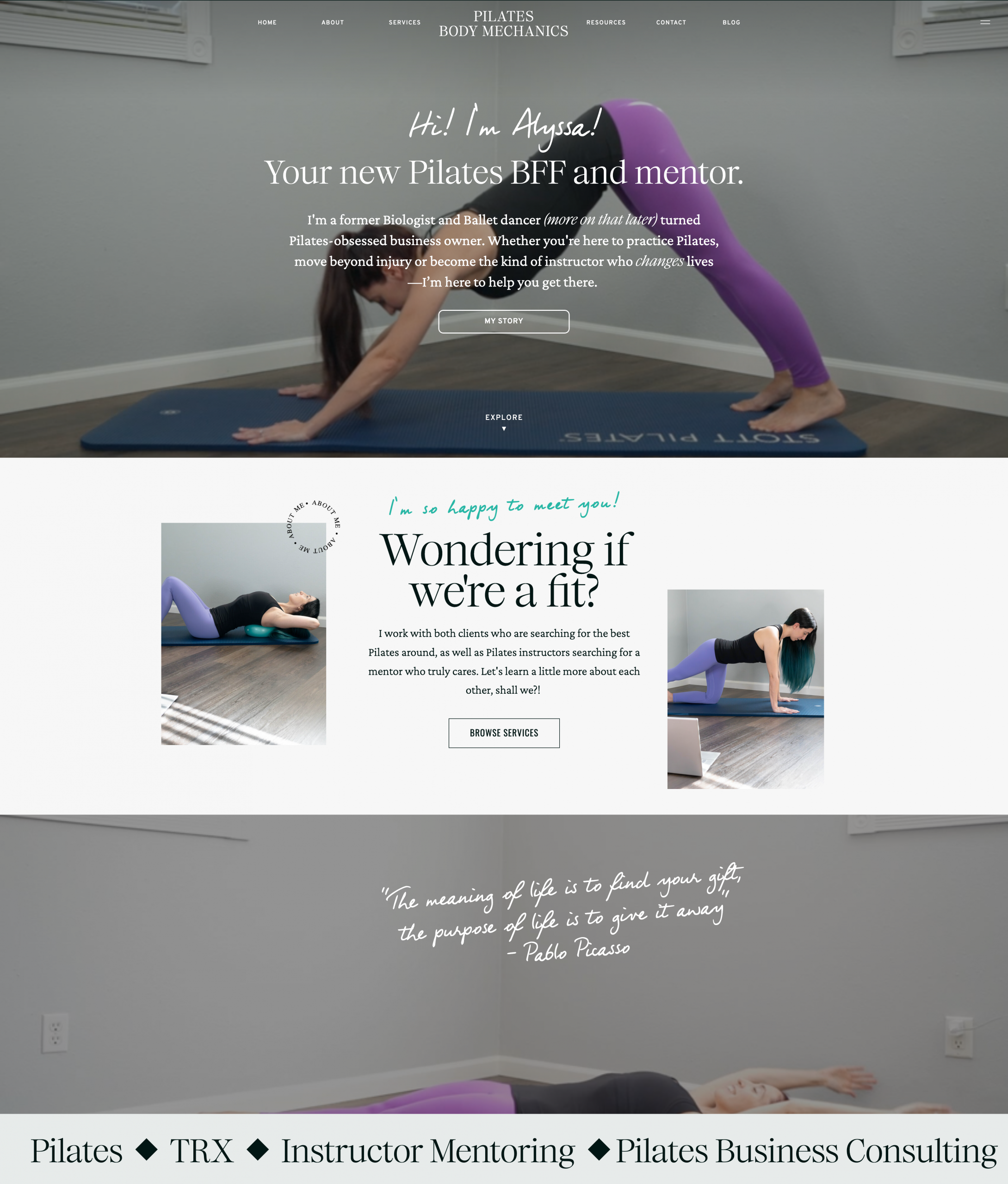
Website: https://bodymechanicspilates.com/
Made with WordPress
What I like:
This site uses pops of purple and accent fonts to give it flair and character without being overwhelming. The design feels familiar and approachable, which works well for building a personal connection with new and returning clients.
Evlo Fitness
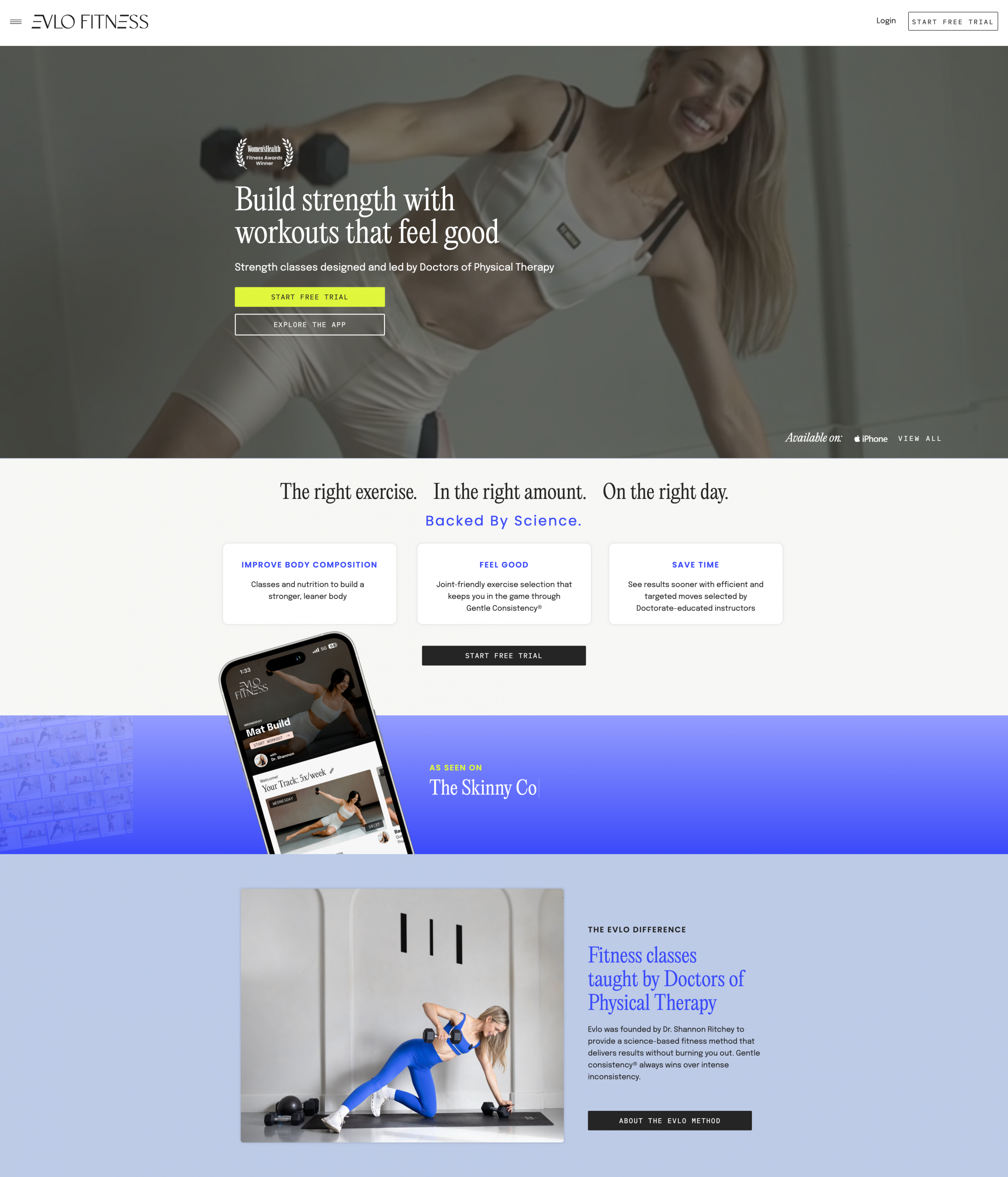
Website: https://evlofitness.com/
Made with WordPress
What I like:
Evlo’s homepage uses strong call-to-action placement and includes award highlights that function as compelling credibility markers. These trust elements help position the studio as an expert choice in a crowded market and encourage users to take the next step.
The Pilates Class
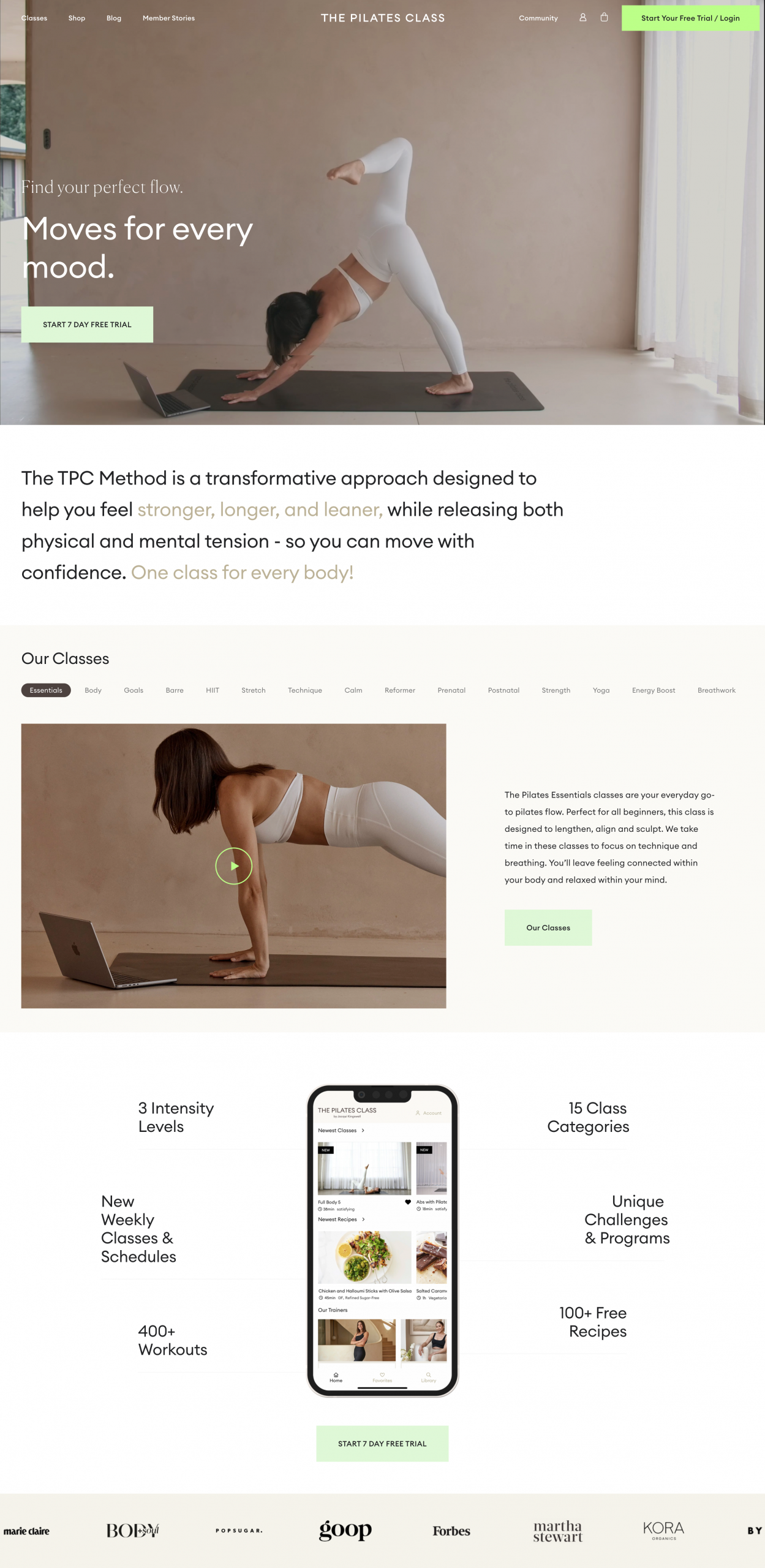
Website: https://thepilatesclass.com/
Made with Shopify
What I like:
Neutral colors and a high-impact hero video create a calm but motivating atmosphere. The standout CTA button makes joining or trying a class feel like a natural next step. The design makes a strong first impression while keeping the focus on action.
SOHL Studio
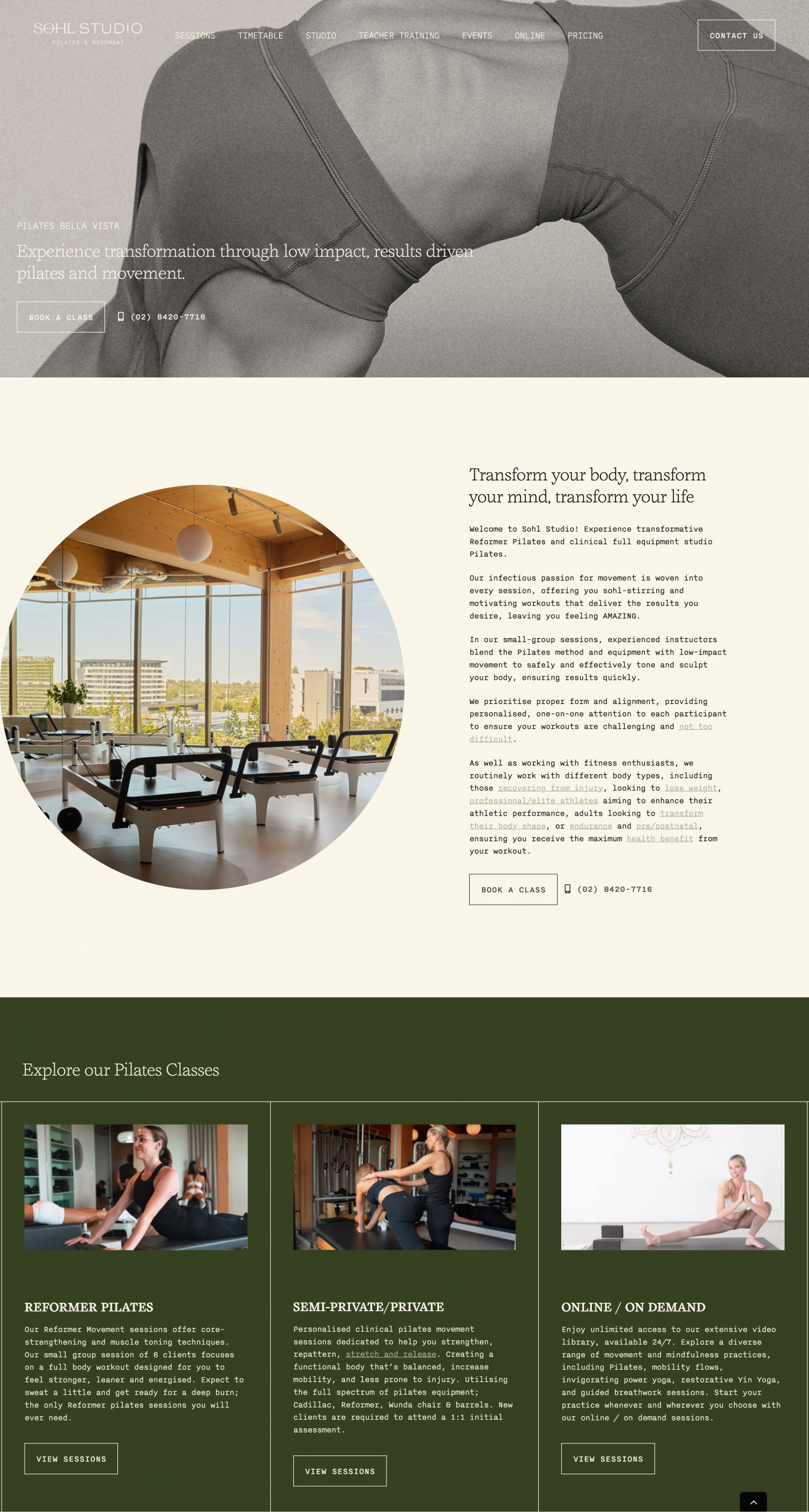
Website: https://sohlstudio.com.au/
Made with WordPress
What I like:
SOHL Studio’s choice of color and typography gives it a fresh retro-modern vibe. The site balances stylistic flair with usability, making it memorable while still easy to navigate for busy visitors.
Vita Pilates
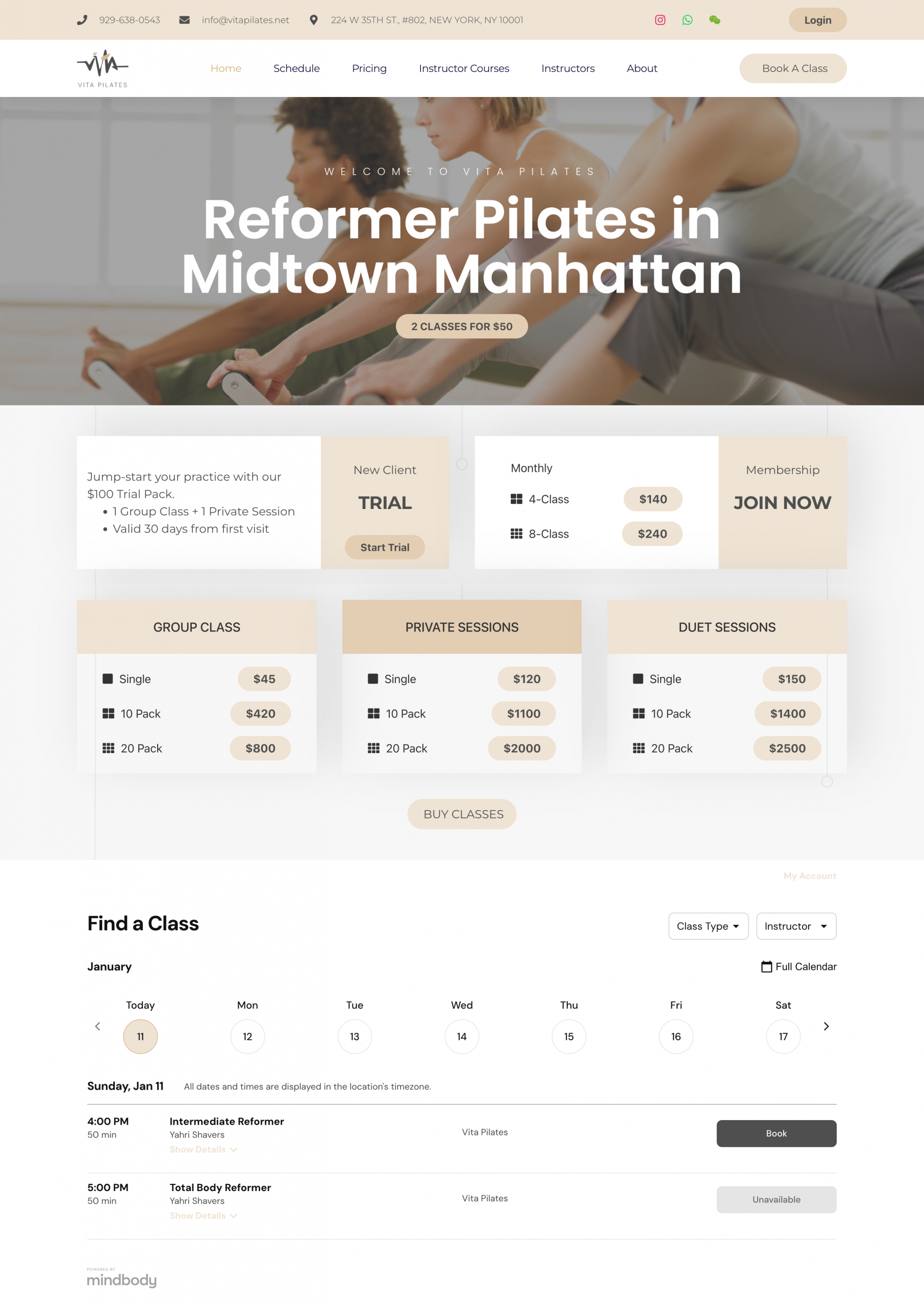
Website: https://vitapilates.net/
Made with WordPress
What I like:
This website nails user experience by putting key information front and center. Studio details, class pricing, and contact info are easy to find, and visitors can book directly from the homepage. Clear navigation and straightforward messaging reduce friction and help convert curious browsers into clients faster.
Balance By Hannah
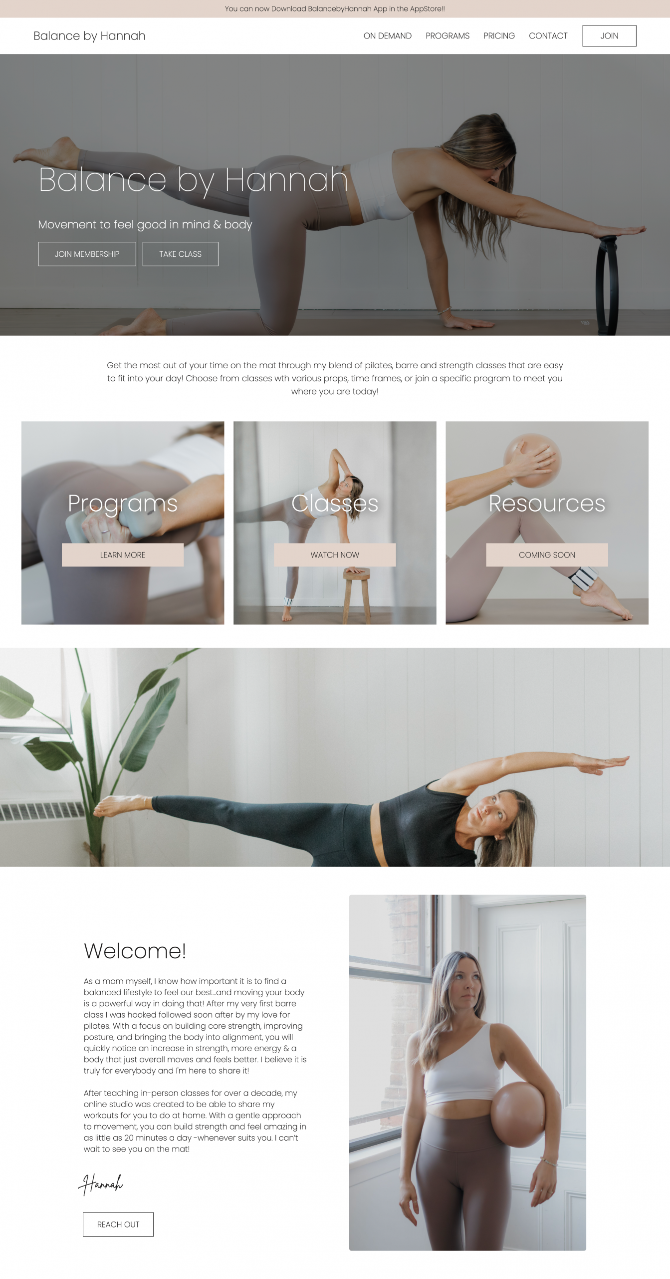
Website: https://www.balancebyhannah.com/
Made with Webflow
What I like:
Balance By Hannah is clean and direct, helping visitors see class options and pricing right away. Transparent pricing and easy access to class types eliminate guesswork, which reduces hesitation and supports higher conversion.
Sasha Alex Morgan
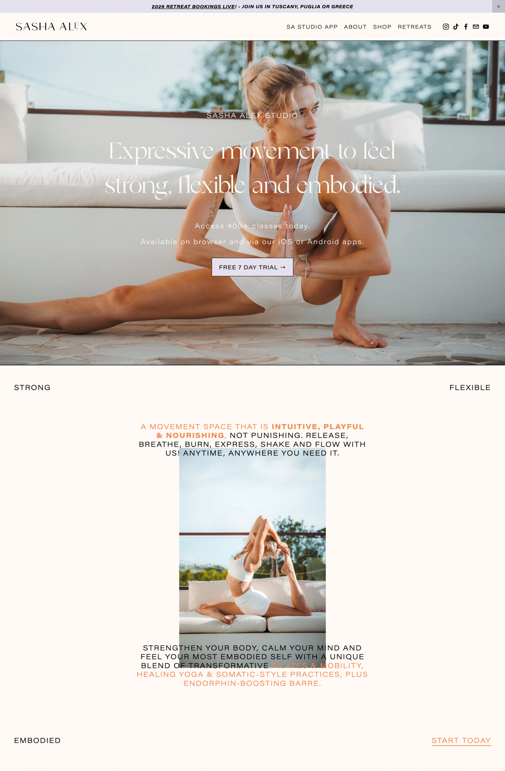
Website: https://sashaalexmorgan.com/
Made with Squarespace
What I like:
This site uses earthy tones and thoughtful navigation to create a grounded, personal brand feel. The simplicity and warmth of the navigation help users explore with confidence, while the palette reinforces the instructor’s unique personality and approach.
Barre Definition
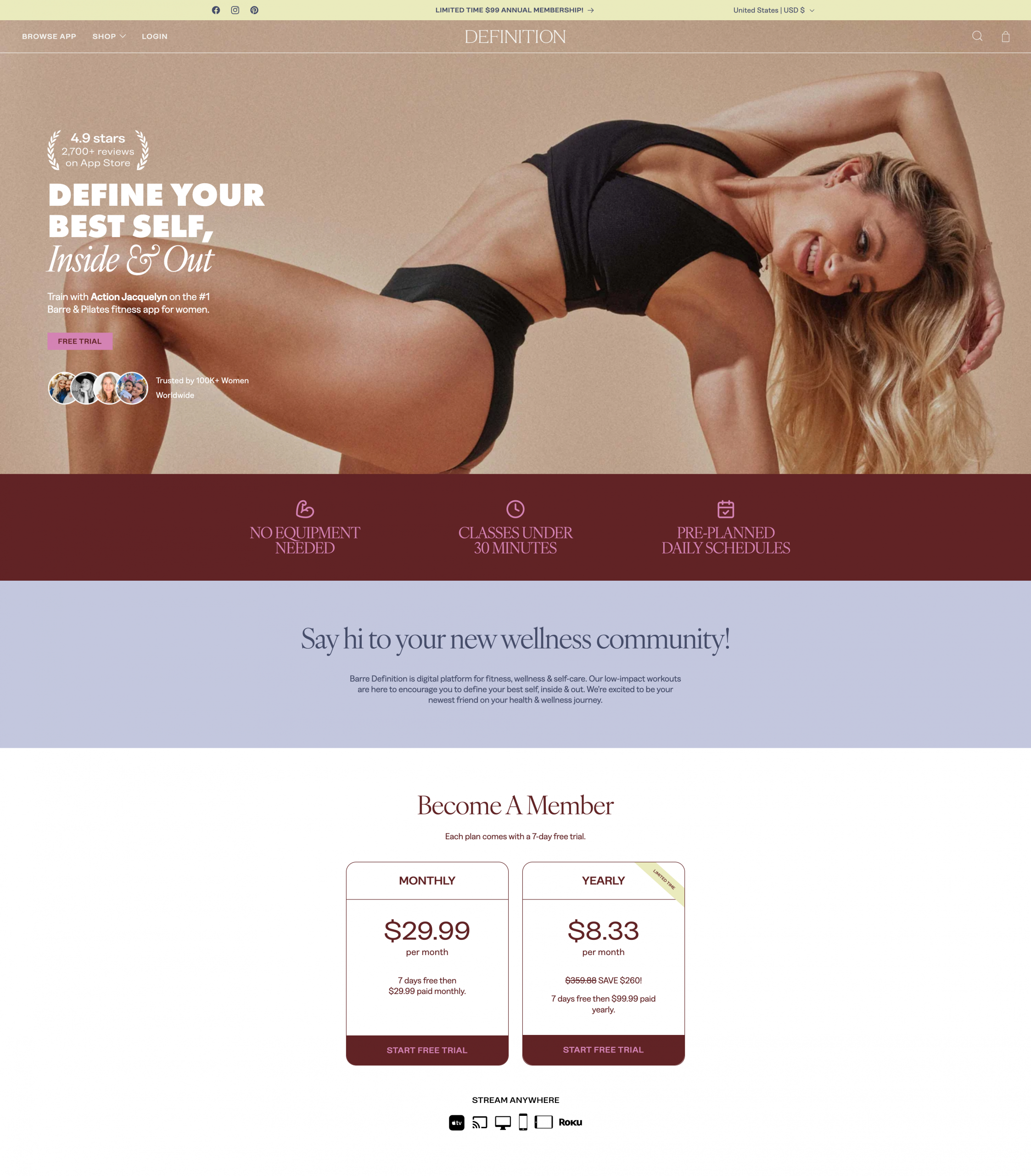
Website: https://barredefinition.com/
Made with Shopify
What I like:
This site stands out with a bold and playful color palette that breaks from the typical muted wellness tones. The energy feels intentional and welcoming, drawing visitors in right away. Social proof is used right up front above the fold, helping build trust instantly and making the booking decision feel easy.
Forma Pilates
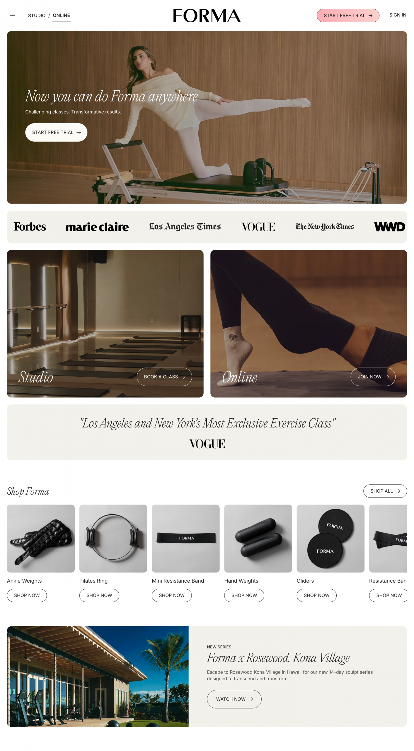
Website: https://formapilates.co/
Made with React (custom coded)
What I like:
This is one of the sleeker, more custom designs on the list. Rounded borders and modern structure make the user experience feel smooth and intentional, supporting both exploration and conversion.
Pilates with Harriet
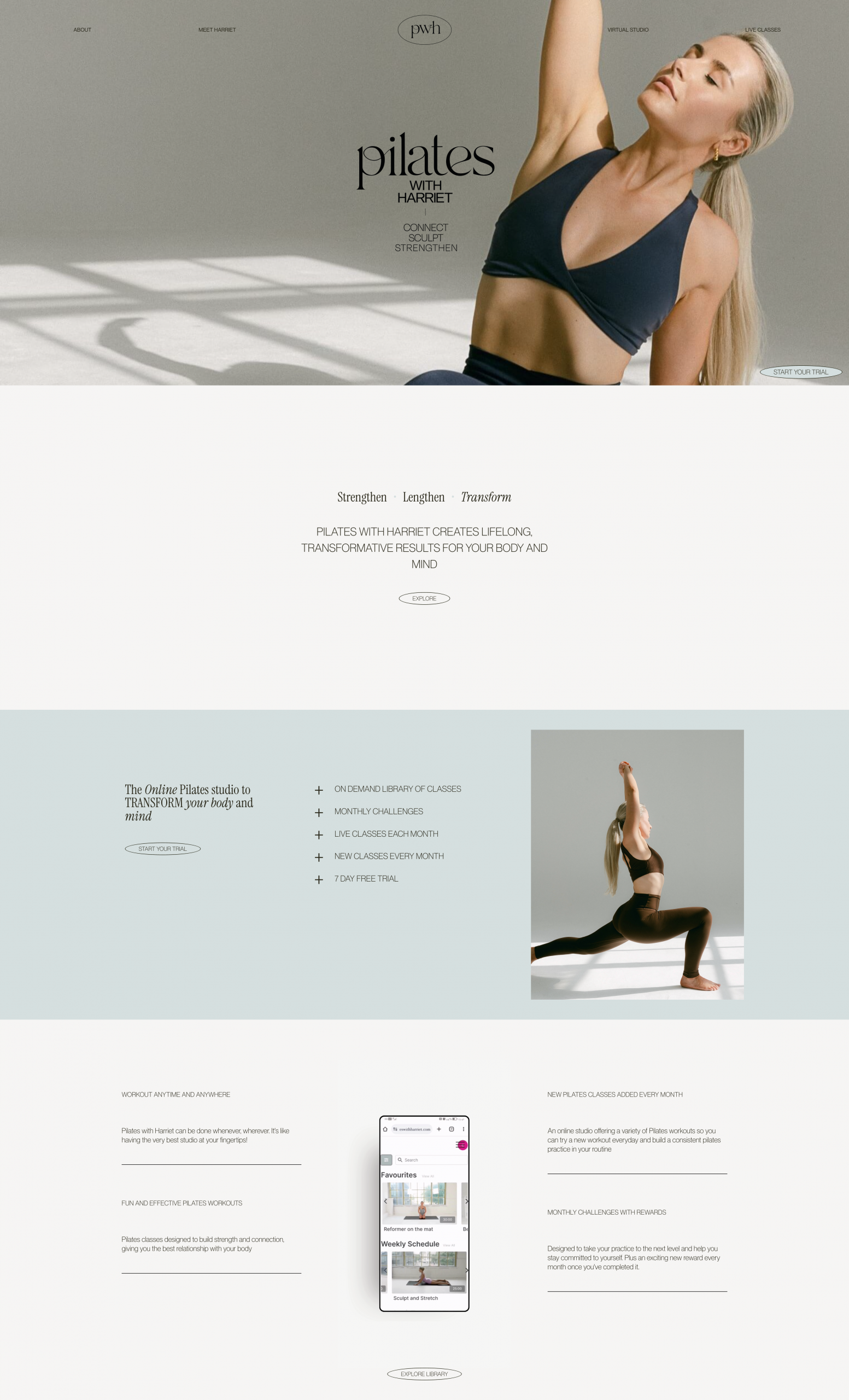
Website: https://pilateswithharriet.com/
Made with Netlify
What I like:
This site leans into white space and minimalism, giving it an aesthetic that feels calm and refined. The clean layout reflects a high-end Pilates experience and helps the brand feel upscale yet accessible.
Bodylove Pilates
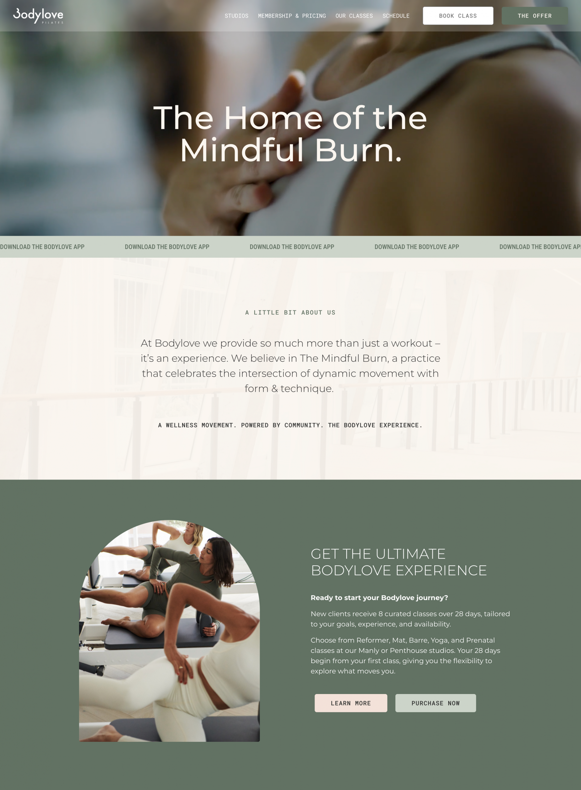
Website: https://bodylove-pilates.com/
Made with WordPress
What I like:
Classic and straightforward, this design focuses on clarity and simplicity. Minimal distractions make it easy for visitors to find exactly what they need, whether that’s class schedules, instructor bios, or booking options.
At its best, a Pilates website feels like an extension of the studio experience itself. Calm, welcoming, grounded, and confident. Great Pilates website design balances beauty with strategy, making it easy for potential clients to connect with you, trust your expertise, and take action.
As you gather inspiration, pay attention to how layouts flow, how content is organized, and how visuals support the overall message. A strong Pilates website should clearly communicate who you are, what you offer, and how someone can work with you, without friction or confusion.
If you are building or redesigning a Pilates website, focus on clarity first and aesthetics second. When structure, messaging, and design work together, your website becomes more than inspiration. It becomes a tool that supports your growth, your schedule, and the long term success of your Pilates business.
Sol the Studio
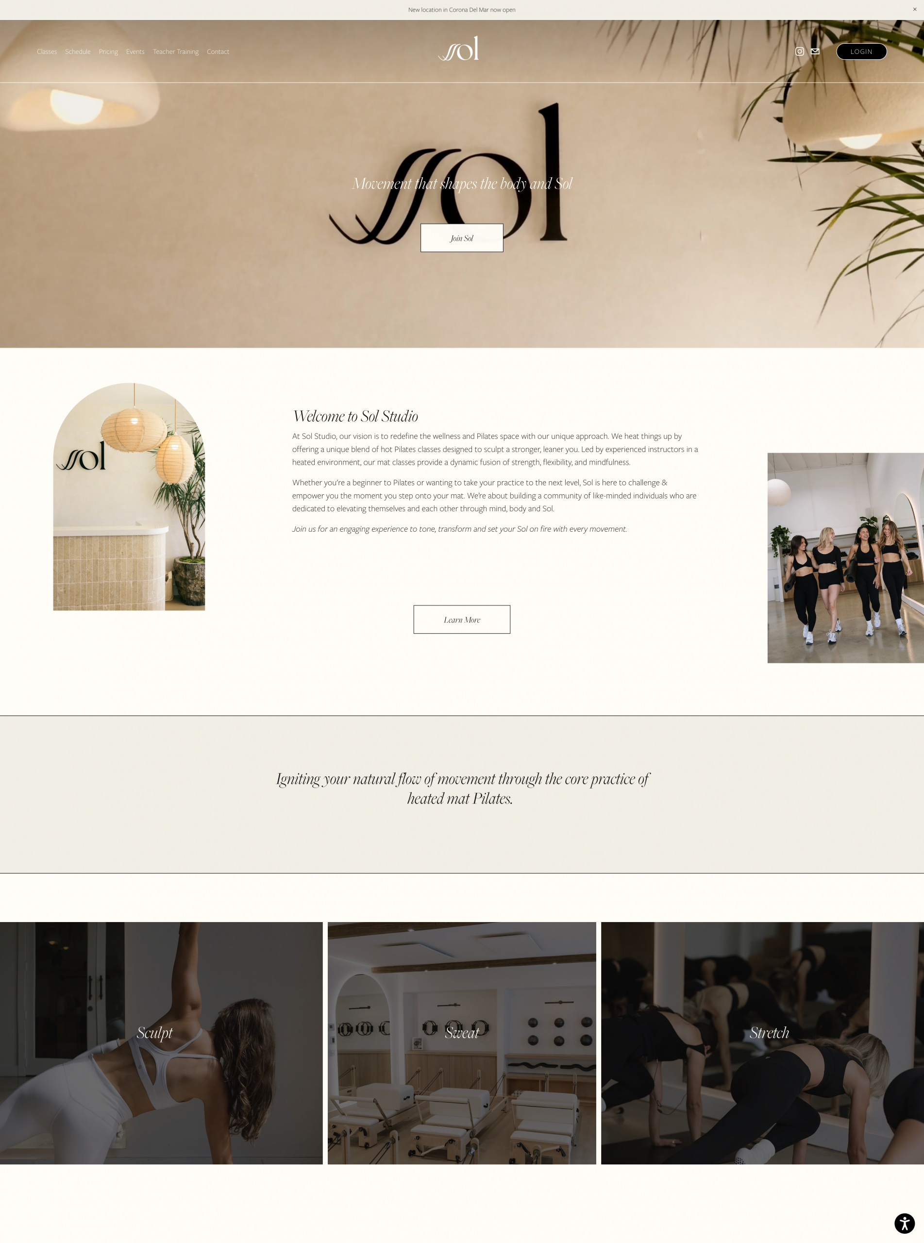
Website: https://www.sol-thestudio.com/
Made with Squarespace
What I like:
This example keeps things simple, giving visitors all the essentials without extras that slow down the experience. It’s a great model for anyone who wants a clean, efficient site that gets users to the information or booking page quickly.